Another Milestone for the Revamped User Interface, Now for the Request Pages
This is part 3 of a series of posts about revamping the user interface of OBS. We started off with the Package pages in October 2018, moved on to the Project, User and Group pages in December 2018, continued with the Request pages in February 2019 and migrated the Configuration pages in March 2019. We then finished the Maintenance pages in April 2019, the Search and Kiwi Editor pages were completed in May 2019. In June 2019 we focused on the Cloud and Monitor pages. The whole migration was finished in September 2019, bye bye bento!.
New year, new milestone!
Here is a comparison of the old and new user interface of the request overview page:
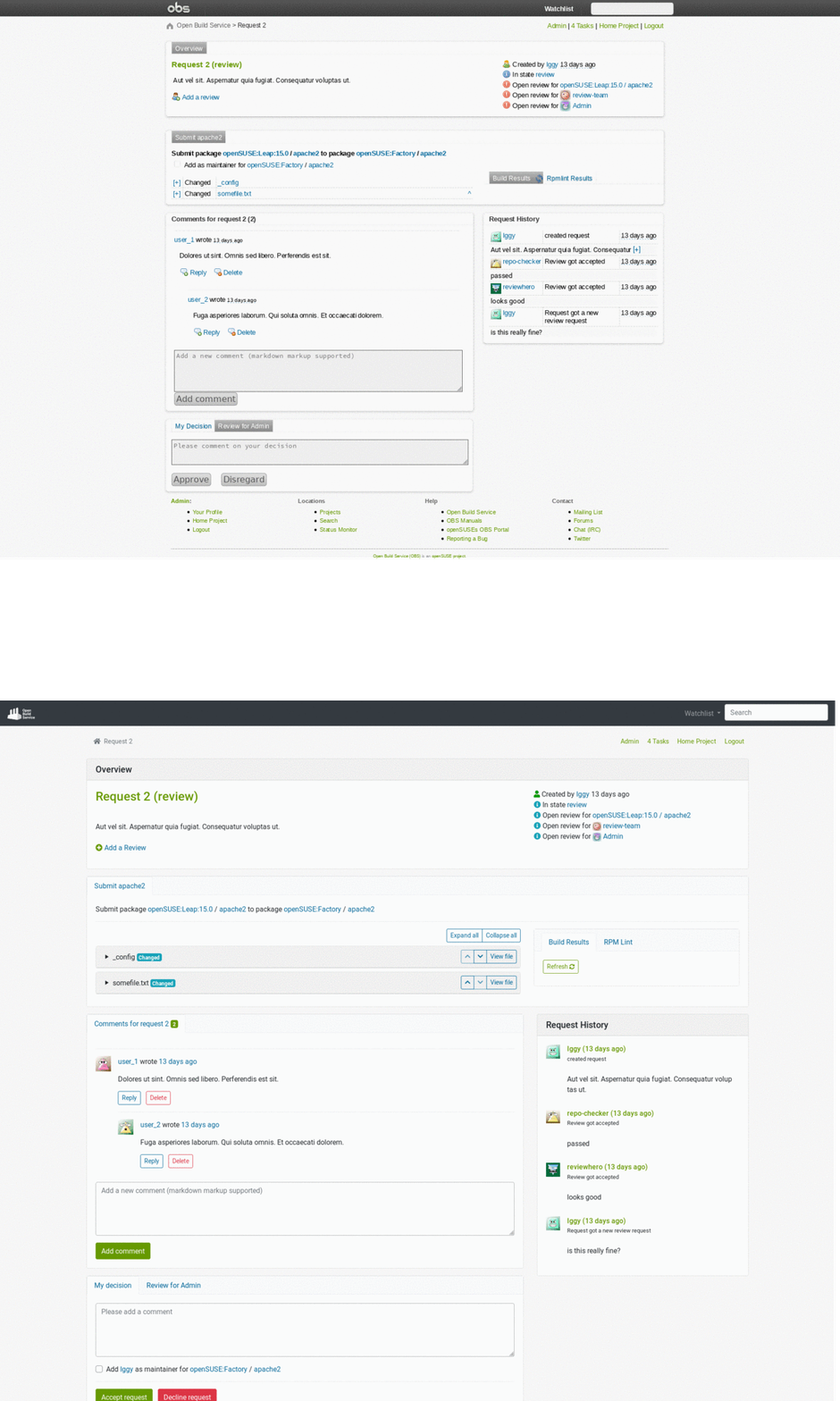
The Request Overview Page
This is where most of our work happened in this release.
We refreshed the page while keeping its current form.
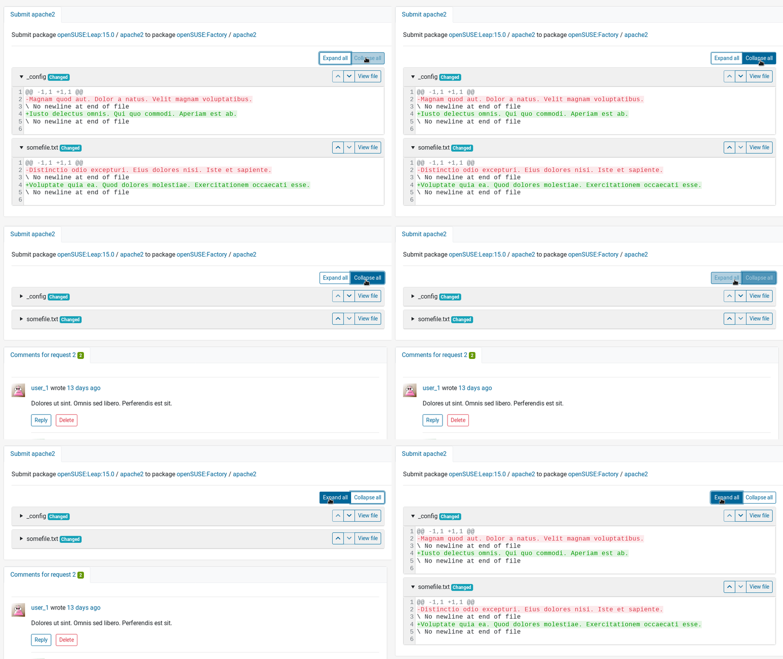
We added some quality of life improvements, such as the Expand/Collapse all buttons for the diffs.
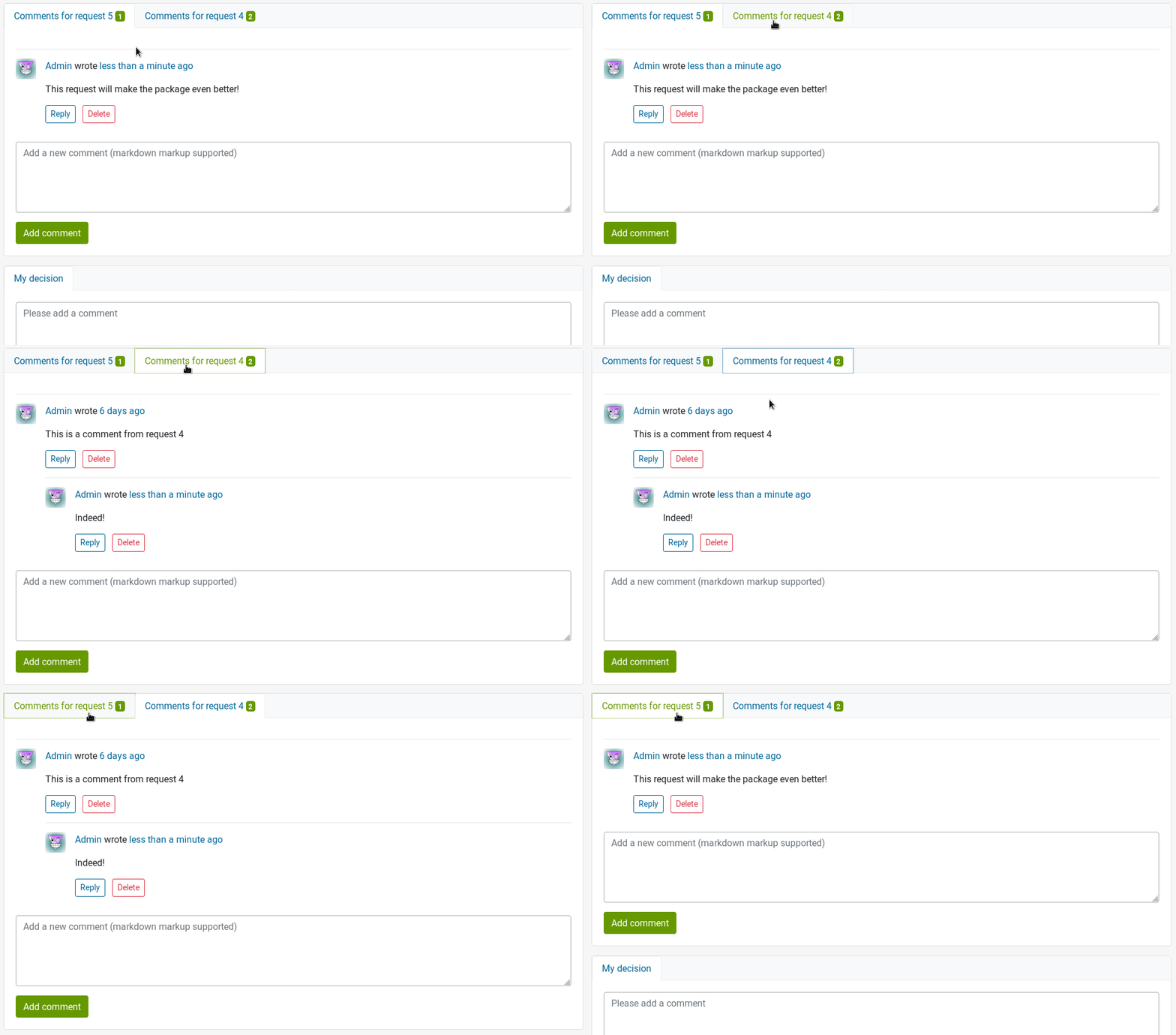
The comments from a superseded request are now under a tab, next to the request’s comments.
Improvements for the Project Monitor Page
We fixed a performance regression which caused this page to be really slow for some projects. We realised though that there is still place for improvements and we plan to continue working on the performance of this page.
We made some styling and usability improvements in the monitor page as well.
The filters dropdowns used to close whenever checking/unchecking one of their checkboxes, thus selecting several options quickly became a nightmare.
We fixed this and also added an option to select all options at once.
Last, the table had rendering errors when used in combination with the table-sm Boostrap class due to a bug in the JavaScript library we use.
Thanks to the help we got from upstream, this is now fixed.
And Much More
We addressed some issues we identified and gathered from your feedback. Here’s a list of what has been done.
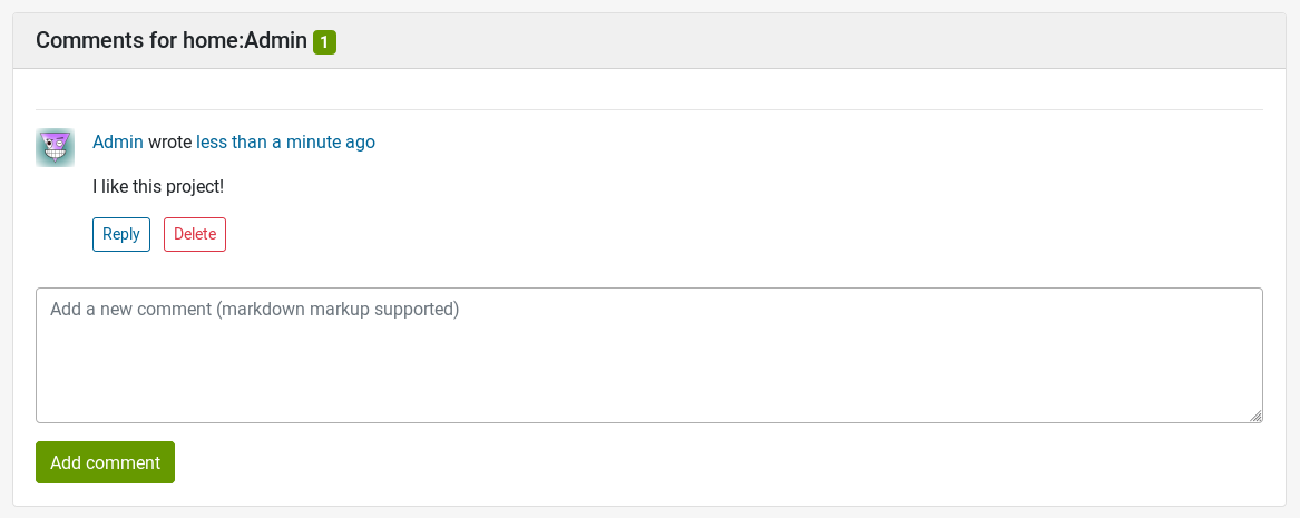
The counters for the comments are displayed with the Badge component from Bootstrap, just like other counters in the revamped user interface.
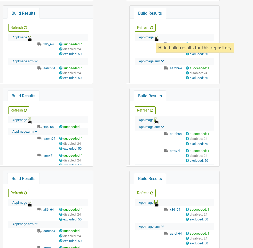
The build results didn’t display all architectures and they didn’t work for multibuild packages. This is now resolved. They are also collapsible, which is the first step to improve the usability of this section for many repositories and architectures.
On a more technical note, we refactored the show action of the request controller. This involved removing some unneeded code and adapting the views to those changes. We also changed the datatables’ pagination to be server-side. This is a performance improvement for datatables with large amounts of data. One concrete example of this is openSUSE:Tools with 74 packages. There is a difference of approximately 2 seconds in the page loading time (from ~ 5.3 to ~3.2 seconds).
How to Give Us Feedback
As always, we need your feedback to make this even better. Don’t forget to join the beta program, try the new user interface and tell us what you think about it. Please read the How Give Us Feedback section in this previous announcement. We are looking for:
- Bugs, so anything breaking workflows.
- Design feedback, so anything related to the user experience and interface.
- How it works on your device / browser.
What Is Coming Next?
We will be working next on the Admin and Search pages. Stay tuned, we will inform you as soon as it is available in the beta program.
We are looking forward to hearing from you on GitHub and in the #opensuse-buildservice IRC channel on Libera.Chat!
