Addressing Typography Issues Part 2
In the last couple of weeks we continued tackling the typography issues in the new UI.
Continued what we started…
We looked for the following issues:
- Looking for different font-sizes and reducing the number of different font-sizes per page to at most 3.
- Looking for color contrasts which could be bad for people with visual issues.
- Reducing the usage of small classes for buttons and other components if not necessary.
- Reworking the hierarchy of the information/text.
- Limiting the line length to 80 characters for readability reasons.
We revisited the following views and applied what we worked out:
- Maintenance/Maintenance Incidents
- User and Group Tasks
- Group Show
- Configuration
- Patchinfo
- Search
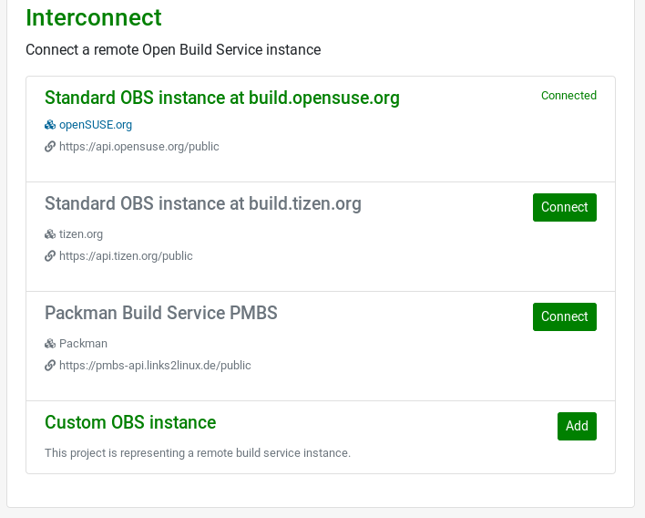
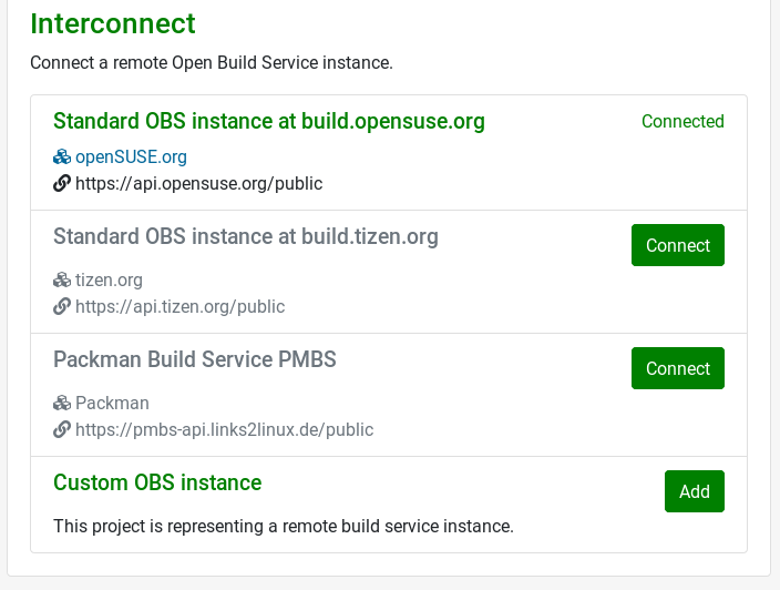
As shown in the following screenshots of the interconnect configuration, we are now using one font-size for the buttons, the links and normal text instead of two. We are still keeping the correct hierachy between the text elements, but without using too many different font-sizes. This is more pleasant for the eye. Less is sometimes more.
Before
After
Responsive Web Typography
In this sprint we started doing research about responsive typography in the web. Based on the research we decided to enable the Responsive Font Size engine in Bootstrap and to configure it accordingly. Various elements like headings will now scale dynamically depending on the screen size. This way the size of the elements is more appropriate on the corresponding end device.
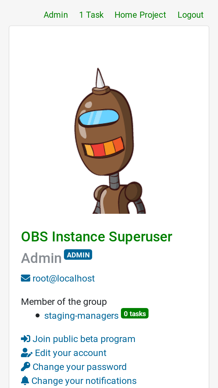
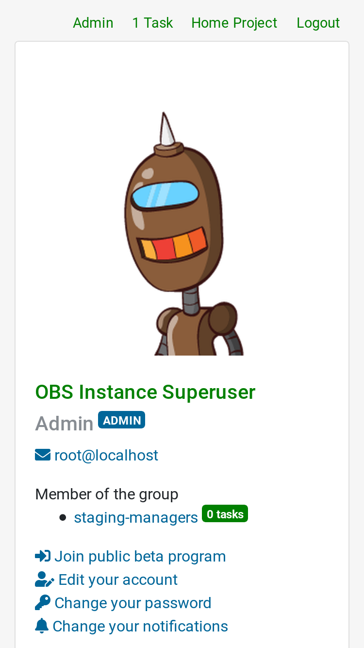
As shown in the example, the screenshot on the right side has slightly smaller headings on the mobile device, thanks to the responsive fonts.
What else happened?
Coderay for read-only diffs
The Open Build Service moved from Codemirror to Coderay to show the read-only diffs. This results in a faster rendering times of the corresponding views, especially in requests with a lot of file diffs.
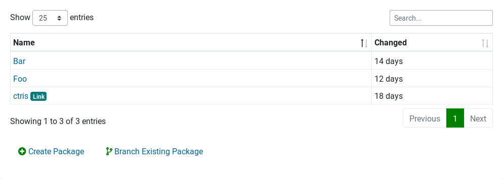
Badge on linked packages
To easily identify a linked package in a list of packages, a badge got added next to the package link. This is especially useful for people who are dealing a lot with interconnects.
Getting closer to Rails 6
We like to stay as close as possible to the latest Ruby on Rails version. This is why we started investigating into the the migration from Rails 5 to 6. As a first step, various gems in the Open Build Service project got updated and are now ready for Ruby on Rails 6.
Fixed Issues
Besides new features and improvements we tackled several issues that got reported. The overflowing request comments got fixed and we removed the zebra striped tables to improve the readability of colored text elements inside the tables.
Tables Before

Tables After

How to Give Us Feedback
As always, we need your feedback to keep on improving the user interface. Have a look at what changed and tell us what you think about it.
There are two ways to reach us:
- On GitHub, by opening an issue and / or commenting on an already opened issue.
- On IRC, by talking directly to us. We are in the channel
#opensuse-buildserviceon Libera.Chat.
Please note that we favor GitHub to gather feedback as it allows us to easily keep track of the discussions.
