Request Page Redesign
We strive to continuously improve the OBS and find new ways to provide you with a better user experience. For a while now, we have worked our way through the OBS collaboration workflow. How do you learn what other people have done? How can you pay attention to things you are not involved in directly? How can you learn more about the people that you collaborate with?
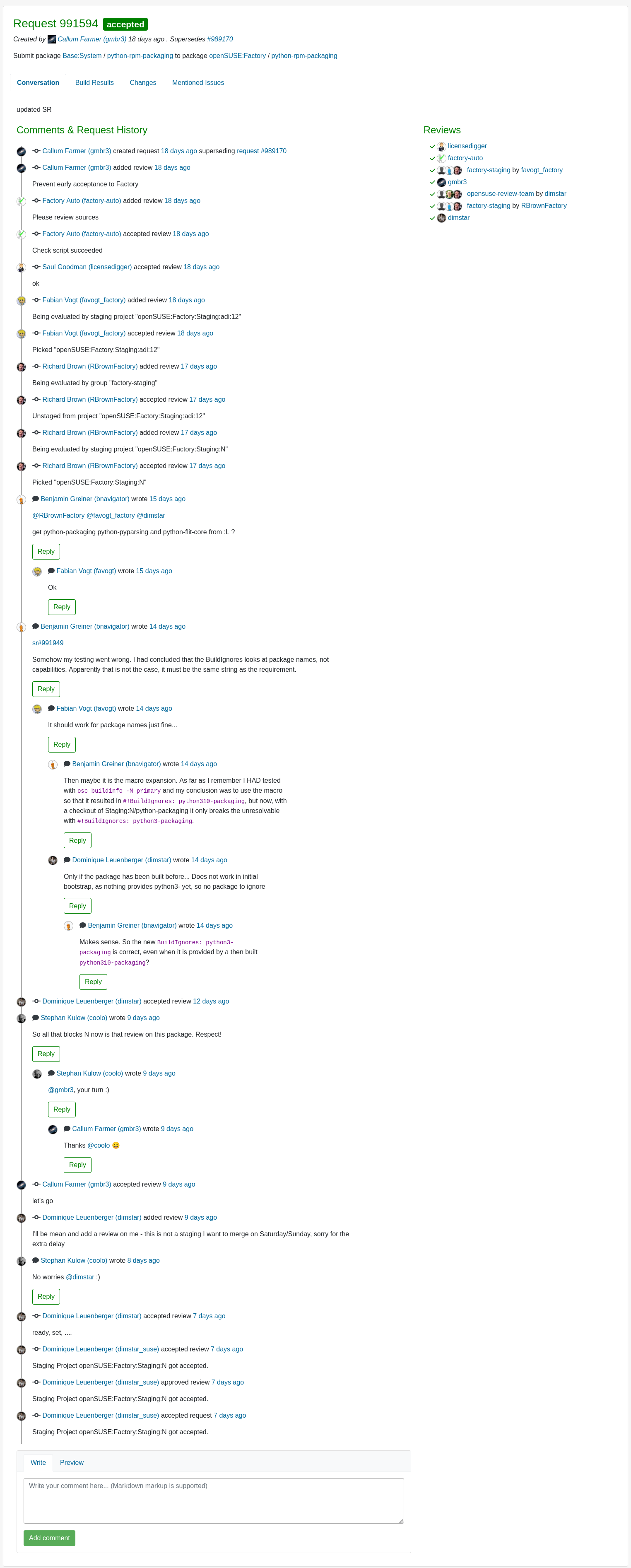
Now it was time to take on the level boss, redesigning the page where nearly all of the collaboration in OBS happens: the Request page.
This update is only available for users in the beta program. Please join the beta program in OBS to be able to use these new updates.
Provide More Information Hierarchy
There is a lot going on when you collaborate on changes in the OBS, especially in the “default” case of proposing code changes to packages. You want to know what is affected and how, why the change was proposed, who is involved, what needs to happen next and what do other people think about this change. The current page puts all of this in front of you at once. A lot of information to digest with little focus.
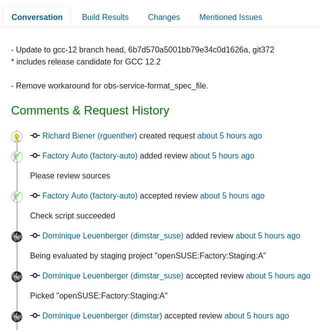
This redesign tries to calm this a bit by breaking down the single page into multiple tabs. Now, you have information about the request divided into four parts: Conversation, Build Results, Changes, and Mentioned Issues.
We proposed this change for you to have clear and broader idea about the request. We think separate place for every piece of information gives you clear understanding and you don’t have to scroll through the page to find something.
Merging Comments and History Into a Conversation
A while ago, Stephan came up with the idea to merge the comments and history into one chronological conversation. And also moving this conversation to the center of the focus, because we think the journey of the proposed changes is the most interesting part to follow for everybody looking at the request.
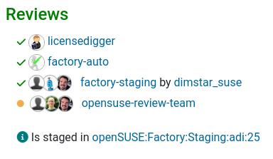
Presentation of Reviews
We also realized it wasn’t easy to track the progress of the reviews. Who has already reviewed things? Who still needs to review the changes? So now, we present them in a way that helps you to understand the state of the requested reviews.
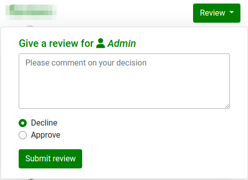
Making Decisions
The current design handles all the decisions that you possibly can take in the same way, in one place. But giving a review is something else and often has different consequences than declining a request, right? With the new design, we propose separating the decisions for reviews.
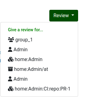
It’s not unusual that you are asked to give reviews from different perspectives. You now have a clear indication for whom you’re giving the review, being a user, a group, a project or a package.
What’s next?
So those are the first steps in our request redesign, we hope you like them.
Of course there are some things that do not work yet. Like requests with more than one action, the build results and issue tabs, some of the intricacies of maintenance requests or even simple things like line anchors for the diffs.
But this for sure isn’t the last time we are going to iterate over this. There is so much more to come. As usual, you can follow what we are planning in our backlog and on GitHub issues and pull requests. And please, don’t be shy to give us feedback. You need to tell us what you think, we do this for you! 💚
How To Give Us Feedback
There are two ways to reach us:
- On GitHub, by opening an issue and / or commenting on an already opened issue.
- On IRC, by talking directly to us. We are in the channel
#opensuse-buildserviceon Libera.Chat.
Please note that we favor GitHub to gather feedback as it allows us to easily keep track of the discussions.